Form: Custom Components
One of the powerful features of the formsflow.ai platform is the ability to create custom form components. This is done by extending a base component class that closely matches the functionality you want to build. You can override existing methods or introduce new ones to implement your specific logic.
All default components in the platform are implemented this way, so you can refer to them as examples by reviewing the source code of the Formsflow renderer.
Extending Components
Every custom component must inherit from a base class that aligns closely with the behavior and data model of your intended component. You can extend any existing component available in the Form.io renderer.
Choosing a Base Component
Start by identifying which existing component most closely matches the functionality you want. For example, to build a multi-button selection component, it is recommended to extend the RadioComponent because it has similar selection behavior.
If no existing component aligns closely enough, you can derive from one of the core classes. These core classes form the foundation of all components in the Form.io renderer:
| Class | Extends | Description |
|---|---|---|
Component | Element | Base class for all components. |
Field | Component | Adds rendering logic for form fields. |
Multivalue | Field | Supports multiple values for a single component. |
Input | Multivalue | Implements HTML input behavior for user interaction. |
How to Extend
To extend a component, reference it from the Components.components object and define your custom class as follows:
const Input = Formio.Components.components.input;

class MyInput extends Input {
  // Override or define your methods here
}
You can now register this custom component and use it in your form schema.
For generic use cases, you can derive your custom component from the Component base class. However, if your component is expected to handle user input or form values, it is recommended to extend the Input class, which provides built-in support for value management and input behavior.
Component Methods
After extending a base component, the next step is to define methods that either override default behavior or add new functionality to your custom component.
To understand which methods are available, review the source code of the base component you are extending, along with its parent classes. This will give you insight into what functionality is inherited and what can be customized.
Most component behavior can be controlled or modified by implementing the following commonly used methods:
const Input = Formio.Components.components.input;

class MyComponent extends Input {
  /**
   * This is the default schema of your custom component. It will "derive"
   * from the base class "schema" and extend it with its default JSON schema
   * properties. The most important are "type" which will be your component
   * type when defining new components.
   *
   * @param extend - This allows classes deriving from this component to
   *                 override the schema of the overridden class.
   */
  static schema(...extend) {
    return Input.schema({
      type: 'mycomp',
      label: 'My Component',
      key: 'mycomp',
    });
  }

  /**
   * This is the Form Builder information on how this component should show
   * up within the form builder. The "title" is the label that will be given
   * to the button to drag-and-drop on the buidler. The "icon" is the font awesome
   * icon that will show next to it, the "group" is the component group where
   * this component will show up, and the weight is the position within that
   * group where it will be shown. The "schema" field is used as the default
   * JSON schema of the component when it is dragged onto the form.
   */
  static get builderInfo() {
    return {
      title: 'My Component',
      icon: 'terminal',
      group: 'basic',
      documentation: '/userguide/#fields',
      weight: 0,
      schema: MyComponent.schema()
    };
  }

  /**
   * Called when the component has been instantiated. This is useful to define
   * default instance variable values.
   *
   * @param component - The JSON representation of the component created.
   * @param options - The global options for the renderer
   * @param data - The contextual data object (model) used for this component.
   */
  constructor(component, options, data) {
    super(component, options, data);
  }

  /**
   * Called immediately after the component has been instantiated to initialize
   * the component.
   */
  init() {
    super.init();
  }

  /**
   * For Input based components, this returns the <input> attributes that should
   * be added to the input elements of the component. This is useful if you wish
   * to alter the "name" and "class" attributes on the <input> elements created
   * within this component.
   *
   * @return - A JSON object that is the attribute information to be added to the
   *           input element of a component.
   */
  get inputInfo() {
    const info = super.inputInfo;
    return info;
  }

  /**
   * This method is used to render a component as an HTML string. This method uses
   * the template system (see Form Templates documentation) to take a template
   * and then render this as an HTML string.
   *
   * @param content - Important for nested components that receive the "contents"
   *                  of their children as an HTML string that should be injected
   *                  in the {{ content }} token of the template.
   *
   * @return - An HTML string of this component.
   */
  render(content) {
    return super.render('<div ref="customRef">This is a custom component!</div>');
  }

  /**
   * The attach method is called after "render" which takes the rendered contents
   * from the render method (which are by this point already added to the DOM), and
   * then "attach" this component logic to that html. This is where you would load
   * any references within your templates (which use the "ref" attribute) to assign
   * them to the "this.refs" component variable (see comment below).
   *
   * @param - The parent DOM HtmlElement that contains the component elements.
   *
   * @return - A Promise that will resolve when the component has completed the
   *           attach phase.
   */
  attach(element) {
    /**
     * This method will look for an element that has an attribute like <div ref="customRef"></div>
     * and then assign that DOM element to the variable here.
     * After this method is executed, the following will point to the DOM element of that reference.
     *
     * this.refs.customRef
     *
     * For DOM elements that have multiple instances in the component, you would make this
     * say 'customRef: "multiple"' which would then turn "this.refs.customRef" into
     * an array of DOM elements.
     */
    this.loadRefs(element, {
      customRef: 'single',
    });

    /**
     * It is common to attach events to your components.
     * This can be done with the "addEventListener" method and send the template
     * reference to that object.
     */
    this.addEventListener(this.refs.customRef, 'click', () => {
      console.log('Custom Ref has been clicked!!!');
    });
    return super.attach(element);
  }

  /**
   * Called when the component has been detached. This is where you would destroy
   * any other instance variables to free up memory. Any event registered with
   * "addEventListener" will automatically be detached so no need to remove them
   * here.
   *
   * @return - A Promise that resolves when this component is done detaching.
   */
  detach() {
    return super.detach();
  }

  /**
   * Called when the component has been completely "destroyed" or removed form the
   * renderer.
   *
   * @return - A Promise that resolves when this component is done being destroyed.
   */
  destroy() {
    return super.destroy();
  }

  /**
   * A very useful method that will take the values being passed into this component
   * and convert them into the "standard" or normalized value. For example, this
   * could be used to convert a string into a boolean, or even a Date type.
   *
   * @param value - The value that is being passed into the "setValueAt" method to normalize.
   * @param flags - Change propagation flags that are being used to control behavior of the
   *                change propagation logic.
   *
   * @return - The "normalized" value of this component.
   */
  normalizeValue(value, flags = {}) {
    return super.normalizeValue(value, flags);
  }

  /**
   * Returns the value of the "view" data for this component.
   *
   * @return - The value for this whole component.
   */
  getValue() {
    return super.getValue();
  }

  /**
   * Much like "getValue", but this handles retrieving the value of a single index
   * when the "multiple" flag is used within the component (which allows them to add
   * multiple values). This turns a single value into an array of values, and this
   * method provides access to a certain index value.
   *
   * @param index - The index within the array of values (from the multiple flag)
   *                that is getting fetched.
   *
   * @return - The view data of this index.
   */
  getValueAt(index) {
    return super.getValueAt(index);
  }

  /**
   * Sets the value of both the data and view of the component (such as setting the
   * <input> value to the correct value of the data. This is most commonly used
   * externally to set the value and also see that value show up in the view of the
   * component. If you wish to only set the data of the component, like when you are
   * responding to an HMTL input event, then updateValue should be used instead since
   * it only sets the data value of the component and not the view.
   *
   * @param value - The value that is being set for this component's data and view.
   * @param flags - Change propagation flags that are being used to control behavior of the
   *                change propagation logic.
   *
   * @return - Boolean indicating if the setValue changed the value or not.
   */
  setValue(value, flags = {}) {
    return super.setValue(value, flags);
  }

  /**
   * Sets the value for only this index of the component. This is useful when you have
   * the "multiple" flag set for this component and only wish to tell this component
   * how the value should be set on a per-row basis.
   *
   * @param index - The index within the value array that is being set.
   * @param value - The value at this index that is being set.
   * @param flags - Change propagation flags that are being used to control behavior of the
   *                change propagation logic.
   *
   * @return - Boolean indicating if the setValue at this index was changed.
   */
  setValueAt(index, value, flags = {}) {
    return super.setValueAt(index, value, flags);
  }

  /**
   * Similar to setValue, except this does NOT update the "view" but only updates
   * the data model of the component.
   *
   * @param value - The value of the component being set.
   * @param flags - Change propagation flags that are being used to control behavior of the
   *                change propagation logic.
   *
   * @return - Boolean indicating if the updateValue changed the value or not.
   */
  updateValue(value, flags = {}) {
    return super.updateValue(value, flags);
  }
}
Component Modules
Custom components can be registered with the renderer using a module that is also able to include a large number of components.
These components can then be included in the module by creating an export of these components like so.
import components from './components';
import templates from './templates';
export default {
  components,
  templates
};
Using Custom Components in Applications
Once these components are created as a module, they can then easily be added to the renderer using the Formio.use method as follows.
import { Formio } from 'formiojs';
import YourModule from './yourmodule';
Formio.use(YourModule);
Once this is done, any new components that have been added to the renderer / builder will show up and can be used.
Examples
-
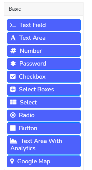
Google Map integration.
We have created a custom component integrating Google Maps. The Google Maps API Key can be called from .env file and thus you need to include the key in the .env file like
REACT_APP_GOOGLE_MAP_URL="YOUR GOOGLE MAP API KEY HERE"The last component in the image below is the one which we created as the new custom component for “Google Map”.
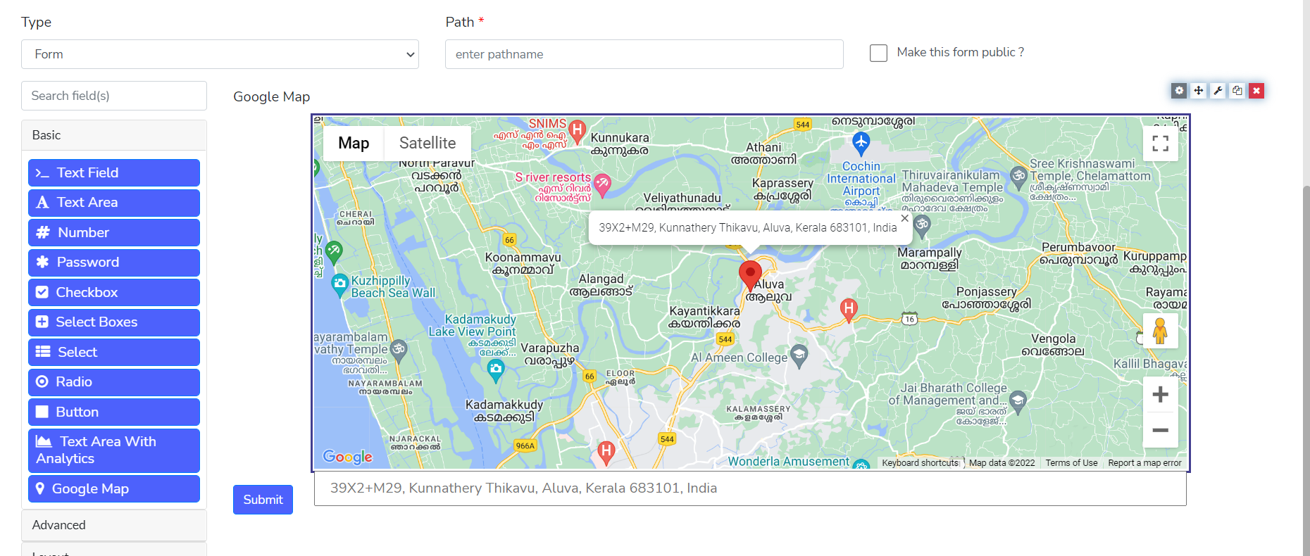
And the resultant component will look like this:
Follow the link for further references and code base for the implementing the Google Maps service as a custom component:
-
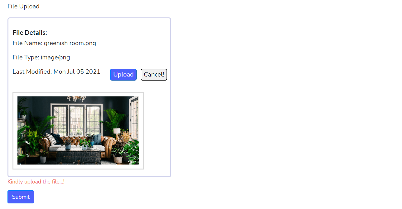
Custom file upload Component
We have created a custom component for file upload for the customization of the file upload where we can upload the files and save the data in a different database(maybe our own separate database). Usually we save the file data in the space provided by the Form.io, By implementing the custom file upload, we can save the data in our own space.
The File Upload component UI will look like
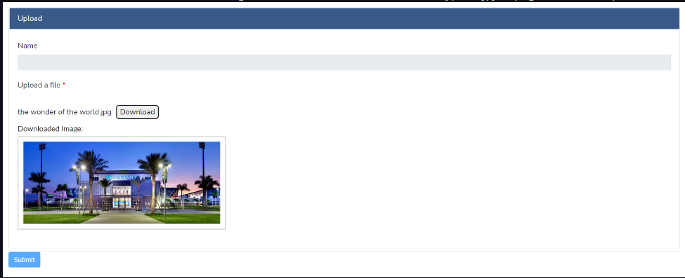
We can download the file from our directory using the file name saved in Form.io server. In this case we have to add the server details in the .env file to which we have to send the file data.
Refer to the code base for further reference.